By Ronald S. Coddington
Pioneer daguerreotypist Marcus Aurelius Root is respected for his portraits of notable Americans taken in his Philadelphia and New York City galleries. He is also noted for authoring The Camera, and the Pencil, a photographers’ handbook published in 1864.
Inside, Root emphasized his view that photography, or Heliography as he often called it, is a fundamentally artistic form. This perspective grew out of his childhood love of sketching and drawing, and failed dreams to become a fine artist that he gratified as a photographer.
Not everyone shared his views during those early days.
“Sun-painting, I was mortified to find, was considered a merely mechanical process, which might be learned in a few weeks, by a person of the most ordinary capacity and attainment.” Root added, “Why (I queried with myself) should not Heliography by placed beside Painting and Sculpture, and the Camera be held in like honor with the Pencil and the Chisel?”
Perhaps nowhere in the book is Root’s vision more evident than a series of six recommendations for successful portrait pictures. These practical tips are also a guide to better appreciate the aesthetic quality and value of historic photographic portraits. You can use them now to make the most of your viewing experience.
The next time you look at a 19th century photograph of a soldier, sailor or civilian, consider the following:
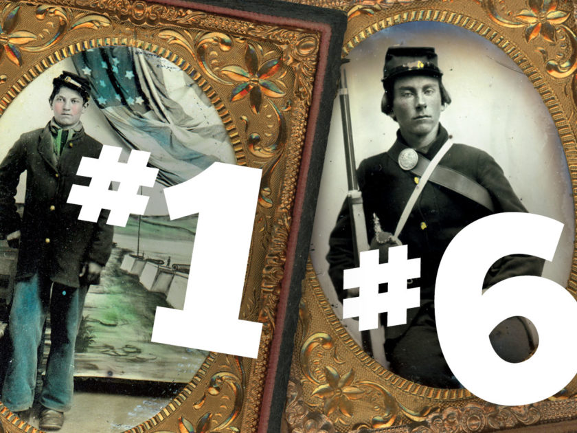
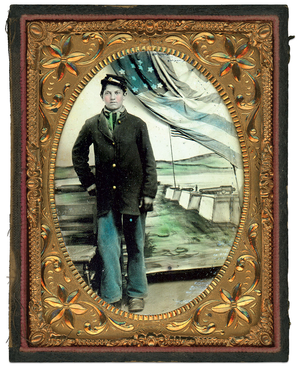
#1 Figure should be off center.
Root: “The figure should rarely, if ever, be in the middle of a picture, or equidistant from each side; nothing is more destructive of pictorial effect, than such a position.”
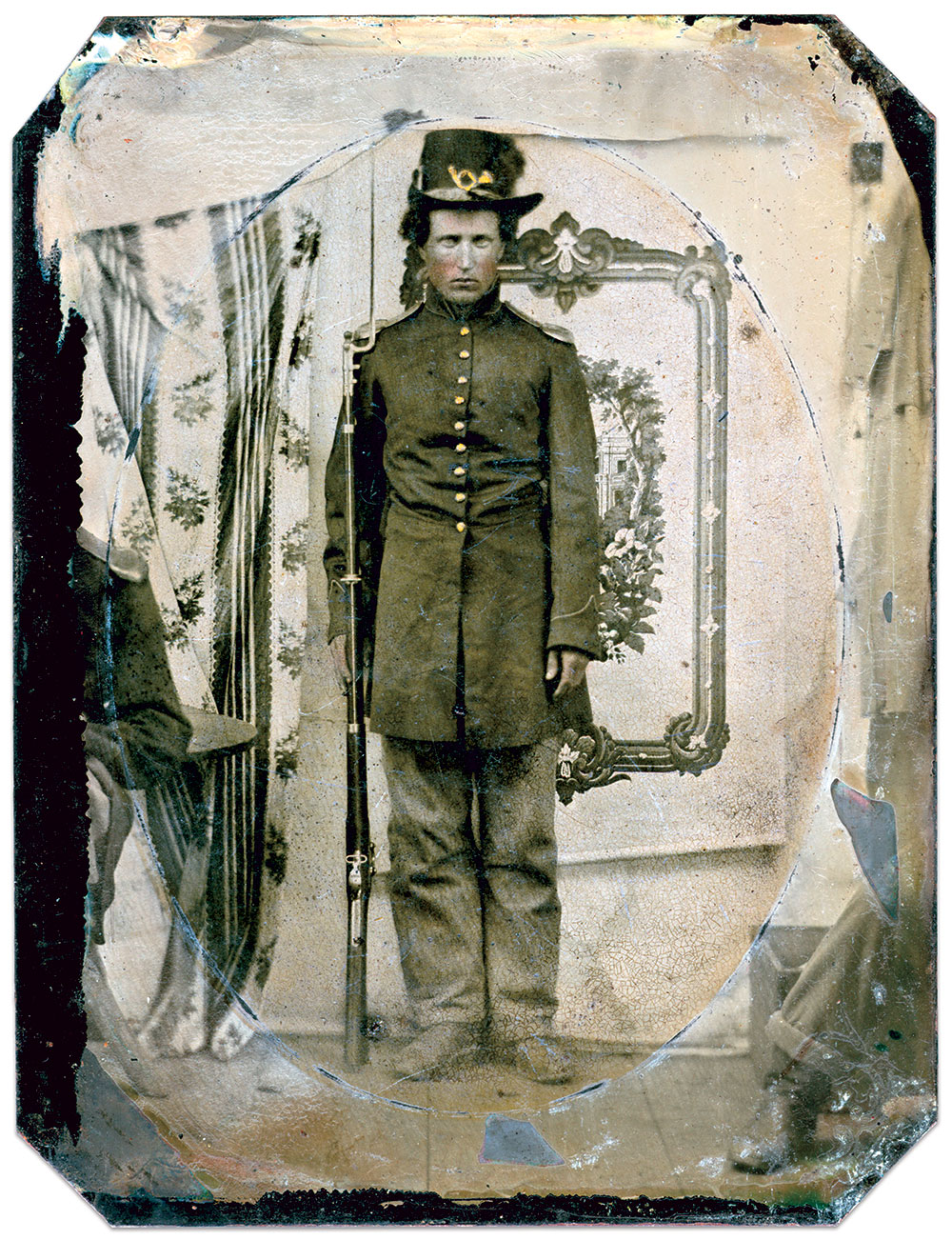
#2 The distance between lens and figure should be greater than figure and backdrop.
Root: “Generally, more space should be in front of the figure than behind.”
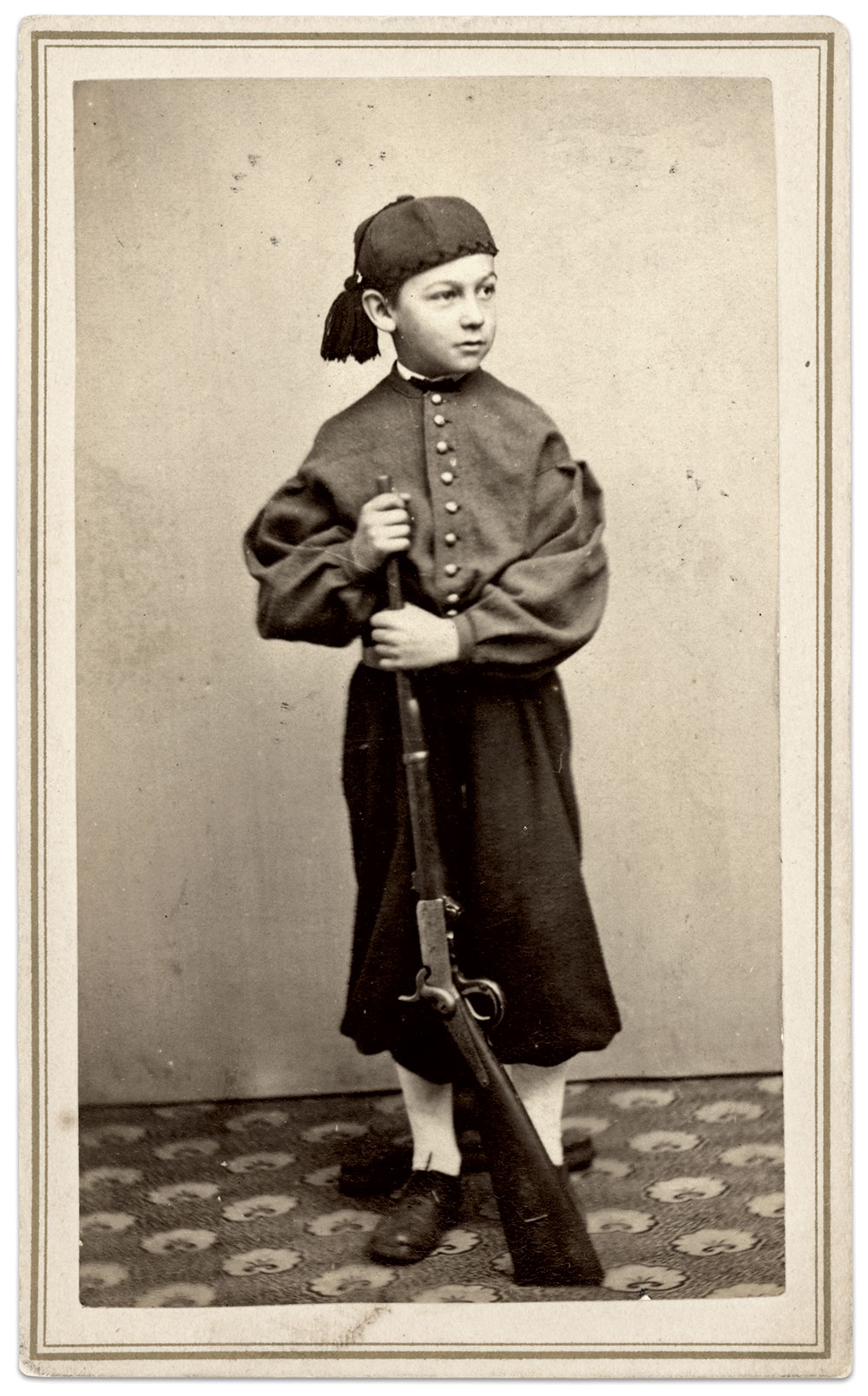
#3 The distance between the top and bottom of the figure should not be equal.
Root: “If the figure be placed equidistant from the top and bottom of the picture, is it still more destructive of pictorial effect and suggestive verity, than if equidistant from the sides. The distance from the top and bottom is the chief means of suggesting the height of the figures. The higher the head is towards the top of the picture, the taller the figure will appear, and the wider the space overhead, the shorter will be the appearance of the model.”
#4 The figure should be composed in an engaging manner.
Root: “Not less important than position, is a purpose in such position. It is not meant by this, that the sitter should always be engaged in some occupation, but care should be taken to avoid the appearance of total vacancy, or of the self-consciousness of having a portrait taken.”
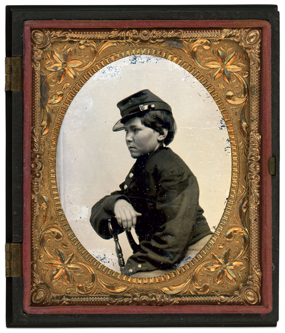
#5 Figure should be lit at a 45-degree angle.
Root: “An essential element, in securing a harmonious contrast of tones, is the judicious lighting of the model. A direct front light should be avoided, as destructive of all relief. Let the light fall on the model at an angle of about 45°; direct vertical light should be avoided, while side light may be used freely.”
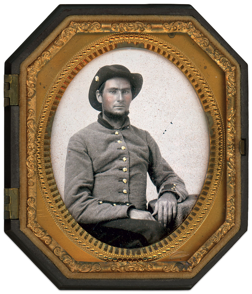
#6 Simple is better.
Root: “In grouping for portraiture, small portraits admit the exercise of considerable discretion, and make the task less difficult than in larger photographic groups; fewer accessories being requisite for the purposes of composition.”
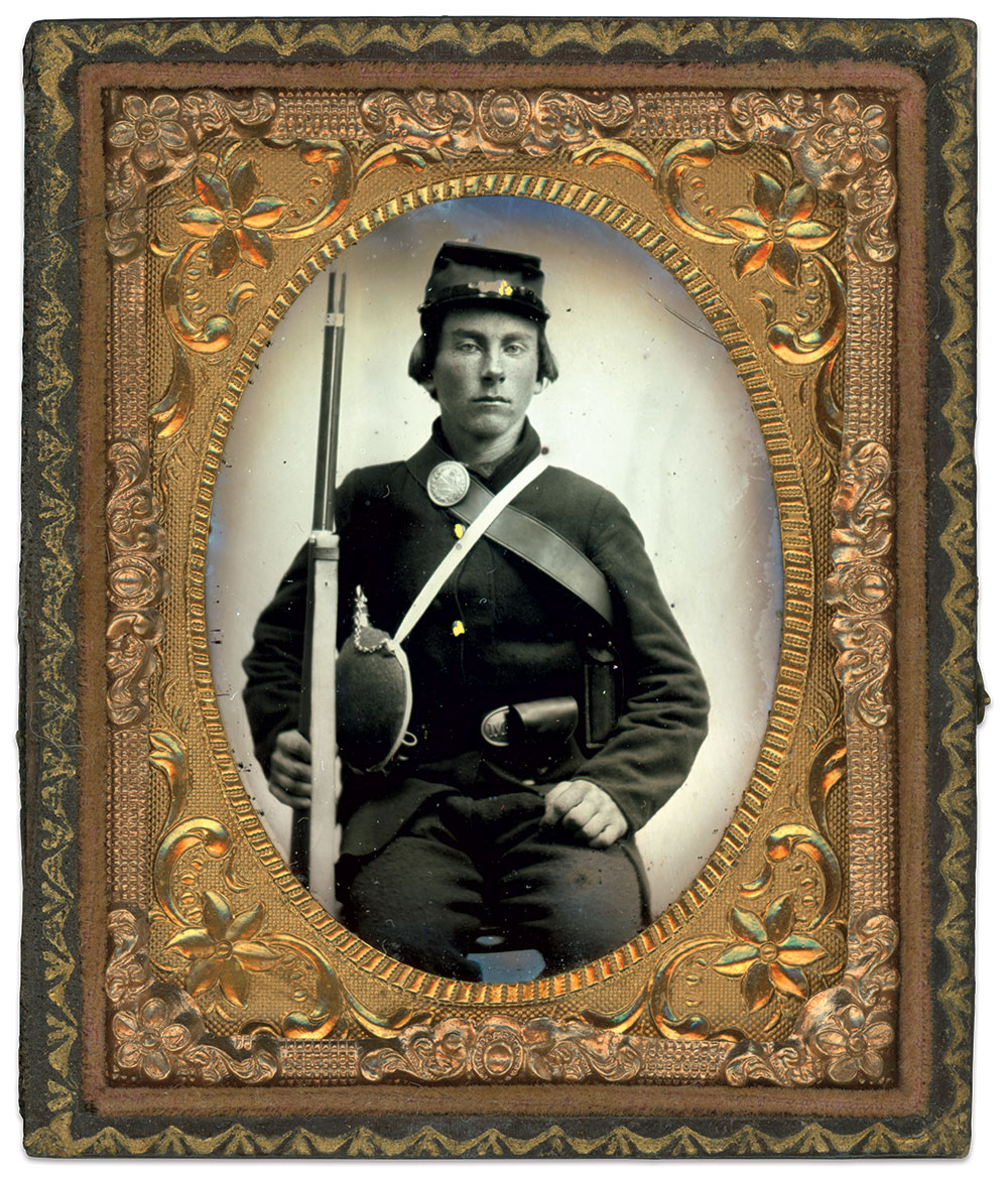
SPREAD THE WORD: We encourage you to share this story on social media and elsewhere to educate and raise awareness. If you wish to use any image on this page for another purpose, please request permission.
LEARN MORE about Military Images, America’s only magazine dedicated to showcasing, interpreting and preserving Civil War portrait photography.
VISIT OUR STORE to subscribe, renew a subscription, and more.

